On this page:
Choose a layout
How to send the options
Layouts 1 to 7
On a phone
Background
Hiding the page furniture
Other display options
Colours
Choose a layout
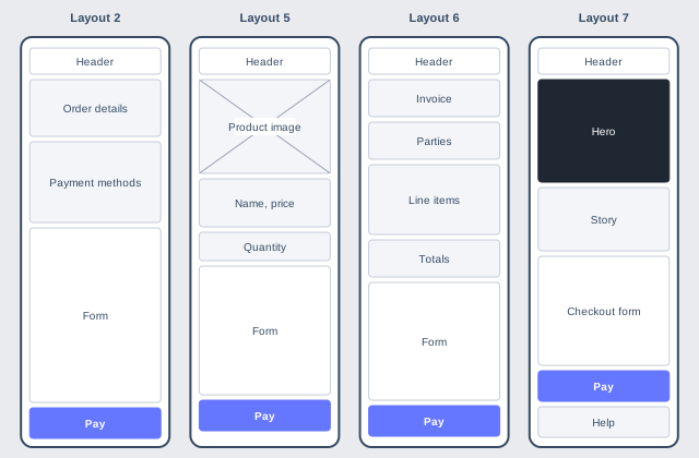
The width is the most the page will take up on a large screen. Layouts 2, 5, 6 and 7 become one column on screens narrower than about 900 pixels.
| Layout |
Name |
Width |
Use it for |
What it needs |
| 1 |
Single column (default) |
520px |
Most payment links, redirects and narrow iframes |
Nothing extra |
| 2 |
Two columns |
1040px |
A desktop checkout with several payment methods |
Nothing extra |
| 3 |
Full width |
100% |
Your own iframe, where you set the width |
Nothing extra |
| 4 |
Iframe look |
600px |
Moving from the Iframe design and keeping the form familiar |
Nothing extra |
| 5 |
Showcase |
1180px |
A product page that ends in a payment |
A product: public_itemId |
| 6 |
Invoice |
1180px |
Invoices and itemised orders |
An order: shop_cartId and trans_refNum |
| 7 |
Landing page |
100%, checkout 960px |
A link sent to someone who has not decided yet |
A product: public_itemId |
How to send the options
Add the options to your hosted page request together with ui_version=11, or make Flow the default design of your account in the MCP under Payment Page > Payment Page Settings. Every other design ignores these options, so sending them is always safe.
Added to your hosted request
&ui_version=11&Layout=2&background=eef2f7&show_chrome=true
| Parameter Name |
Length |
Parameter description |
Mandatory |
| Layout |
1 |
1 to 7, as listed above. An empty or unknown value gives layout 1. |
Optional |
| background |
9 |
Page colour as a hex value. See Background. |
Optional |
| show_chrome |
5 |
true/false. See Hiding the page furniture. |
Optional |
These fields are part of the request, so include them in your signature if you sign the full request. You can also set all three without code in the Wizard Payment page.
The wireframes below show where each part of the page goes. They are not screenshots: colours and text are for illustration, and sections appear only when they apply to the payment. Sheet widths are drawn to scale for a 1280 pixel window. For languages that read right to left, the whole page is mirrored.
Layout 1 - Single column
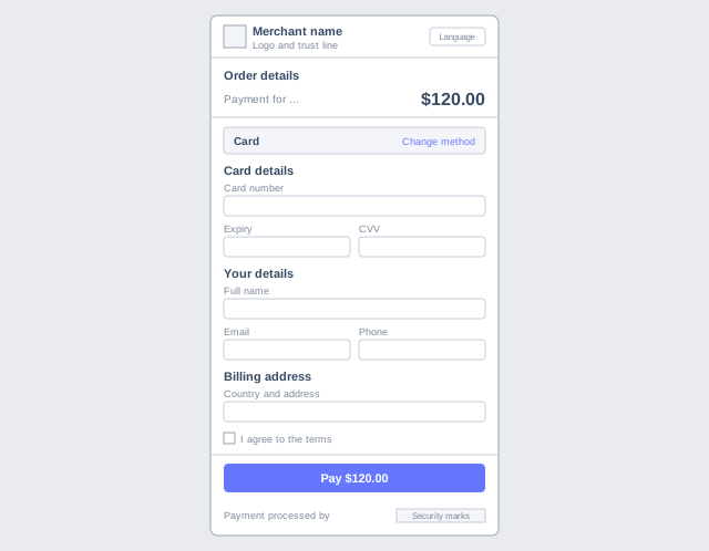
Send Layout=1 or leave it out.
Everything is stacked in one narrow column, so the order on the screen is the order the customer works through.
| Border | A thin frame around the form. On phones it is dropped and the page fills the screen. |
| Payment method | A step of its own: the customer picks from a list, the form opens, and a "change" link brings the list back. |
| Skipping the list | The list is skipped if there is only one method, if every method asks for the same details, or if your request already selects a method. |
| Pay button | Stays at the bottom of the screen while the customer scrolls. |
The method step, the button and the frame work the same way in the other layouts unless their section says otherwise.
Layout 2 - Two columns
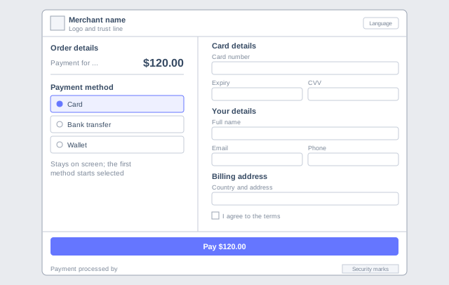
Send Layout=2.
What is being bought and how it will be paid for sit on one side, and everything the customer has to fill in sits on the other.
| Columns | Order column 5 parts, form column 7 parts. |
| Payment method | The list never goes away and the first method starts selected. This is the only layout that does this, and it also applies on a phone. |
| While scrolling | The order column stays in view, unless the window is shorter than 700 pixels. |
| Empty order column | If nothing is left to show there, the form takes the full width. |
Layout 3 - Full width
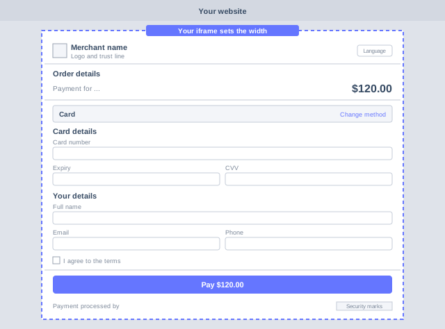
Send Layout=3.
The page fills whatever space it is given instead of being capped and centred. Use it when you place the page in your own iframe and control the width there.
| Border | Never drawn, so it does not fight the edges of your iframe. |
| Arrangement | One column at every width, like layout 1. A small margin stays around the fields. |
| Your own Pay button | See Embed Form to trigger the payment from your page with show_PayButton=false. |
Layout 4 - Iframe look
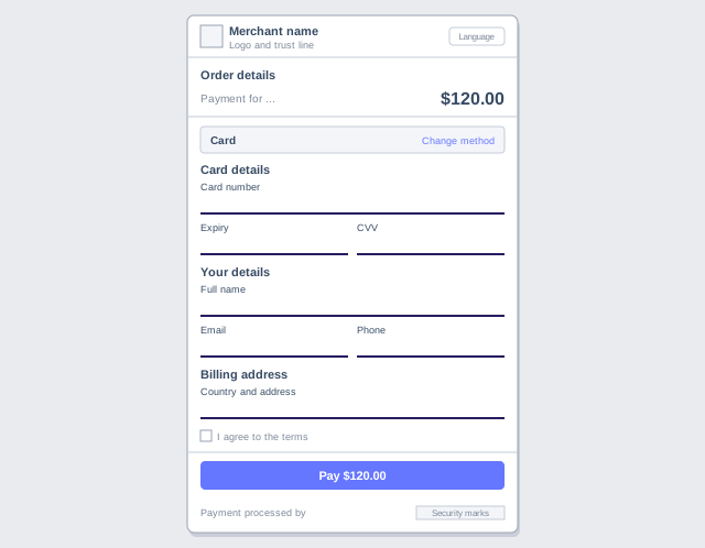
Send Layout=4.
The look of the Iframe design on top of the Flow page. The structure is the same as layout 1, and only the styling changes.
| Sheet | 600 pixels wide with a soft shadow. |
| Fields | Underlined instead of boxed, with a larger label above each one. |
| Colours | Uses the Iframe design's dark indigo. See Colours to change it. |
Layout 5 - Showcase
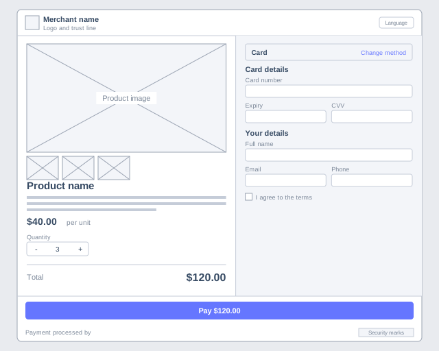
Send Layout=5&public_itemId=88. The picker and unit price appear with show_quantity=true.
An even split with the product as the main content, for a customer who is still looking at what they are buying.
| Product side | Main image with thumbnails, name, description and total. |
| Payment side | A slightly narrower shaded column with the method and the form. |
| Without a product | The left side shows the normal order details instead. |
| Product not available | The form is replaced by a message explaining why. See Product fields. |
Layout 6 - Invoice
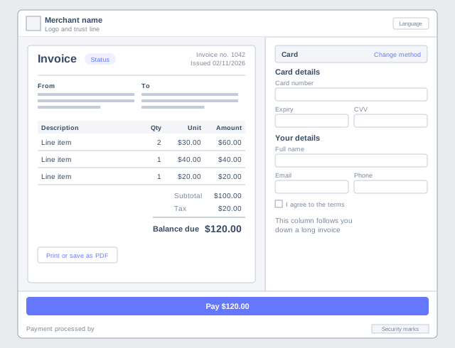
Send Layout=6 with shop_cartId and trans_refNum. Invoices created in the control panel already carry both.
A full invoice document with the payment form beside it, for a payer who wants to check the lines and then settle.
| Document | Status, invoice number, issue date, both parties, line items, tax, totals and the balance due, all taken from your own records. |
| Payment side | A narrower white column that stays in view down a long invoice, unless the window is shorter than 700 pixels. |
| Printing | A "Print or save as PDF" button prints the document alone. |
| Without an order | If the records are missing or belong to another merchant, the normal order details are shown with their lines open. |
| Not shown | There is no due date or overdue state. |
Layout 7 - Landing page
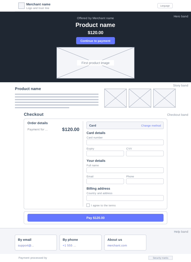
Send Layout=7&public_itemId=88.
A full marketing page with the checkout further down. It is a stack of full width bands rather than a single sheet, and no border is drawn around it.
| Hero | Your business name, the product name, the price, a button down to the checkout and the first product image. |
| Story | The description, keeping the line breaks you typed, and up to three more images. Dropped if you have neither. |
| Checkout | The price and form in a 960 pixel card. Unlike the other layouts, the Pay button does not follow the customer down the page. |
| Help | Your account's support email, support phone and website. Only the ones you filled in appear, and the band is dropped if there are none. |
| Without a product | The hero uses your disp_payFor text, or else your business name, and has no image. |
| Product not available | The hero button reads "Out of stock" or "Not available" and leads to the message in the checkout band. |
On a phone
Below about 900 pixels the side by side layouts become a single column, with the product or invoice first. You can send the same layout for all of your traffic. Layouts 1, 3 and 4 are already a single column.
Background
Send background to set the colour behind the form. The form itself stays white.
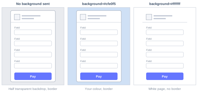
| Accepted values | Hex colours of 3, 6 or 8 digits, with or without the leading #. Write the # as %23 in a URL, or leave it out. Any other value, such as red, is ignored and the default is used. |
| If you do not send it | The backdrop is half transparent, so your own page shows through when the form is in an iframe. |
| White | The border is removed, because there is nothing to separate the form from. |
| Layout 3 | Never has a border, whatever the colour. |
| Layout 7 | The colour fills the page behind the bands. |
Hiding the page furniture
Send show_chrome=false to leave only the payment form and the Pay button, for example when your own page already shows the logo and the order. The values 0 and no work too. Anything else, or leaving it out, keeps the normal page.
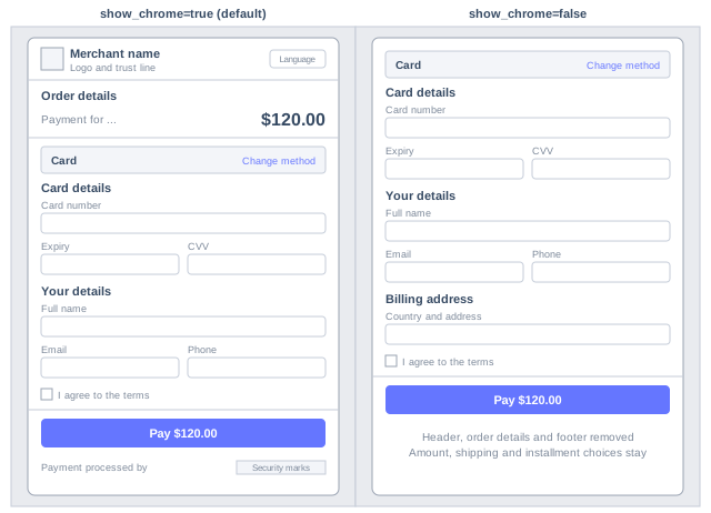
| Removed | The header with logo and language selector, the footer with security marks and brand line, the order details, and the total bar that appears on scrolling. |
| Kept | Amount, shipping and installment choices, because the customer still has to answer them. Also the payment methods, and the countdown if you sent ExpiredOn. |
| With layouts 5, 6 and 7 | The product, the invoice document and the landing bands all count as furniture and are removed too, so these layouts lose their purpose. Use one or the other. |
Other display options
These are not specific to Flow, but they also change what the customer sees on it.
| Parameter Name |
What it does on Flow |
| show_edit |
Details you sent are normally collapsed behind an Edit link. false removes the personal, billing and shipping sections completely, so anything you did not send is never collected. |
| show_marketing |
false hides the marketing consent checkbox. |
| show_PayButton |
false hides our Pay button so that yours can trigger the payment. See Embed Form. |
| show_quantity |
true with a product adds a quantity picker, and the catalogue prices the order. See Product fields. |
| disp_lngList |
Narrows the languages offered in the header, or hide removes the selector. |
| ExpiredOn |
Shows a countdown above the form. See Expiration Time. |
| isTOPUP |
1 adds the recipient section. See Top Up. |
Apple Pay and Google Pay buttons appear at the top of the card step. See Apple Pay and Google Pay.
Colours
Flow has its own colour settings. Add them to your Custom CSS. The --Gateway settings described on that page belong to the older designs and do not apply here.
Custom CSS
:root {
  --flow-accent: #1a5fd0;          /* links, selected options */
  --flow-accent-hover: #164ea9;
  --flow-accent-contrast: #ffffff; /* text on the accent colour */
  --flow-accent-soft: #eef3fd;
  --flow-focus: #1a5fd0;           /* outline of the active field */
  --flow-submit-ready: #0d7048;    /* Pay button once the form is complete */
}

/* Layout 4 sets its own colours, so address it directly */
body.flow[data-layout="4"] {
  --flow-accent: #251d60;
}

/* The hero of layout 7 */
body.flow[data-layout="7"] {
  --flow-hero-bg: #14161b;
  --flow-hero-ink: #ffffff;
}